Nomad Kitchen

Overview
Nomad Kitchen is a modern, minimalist food concept built around movement — a kitchen with no fixed address, serving refined food wherever it goes. Founded in 2024, the brand needed an identity as clean and intentional as the food itself, far removed from typical street food visual language.
The Challenge
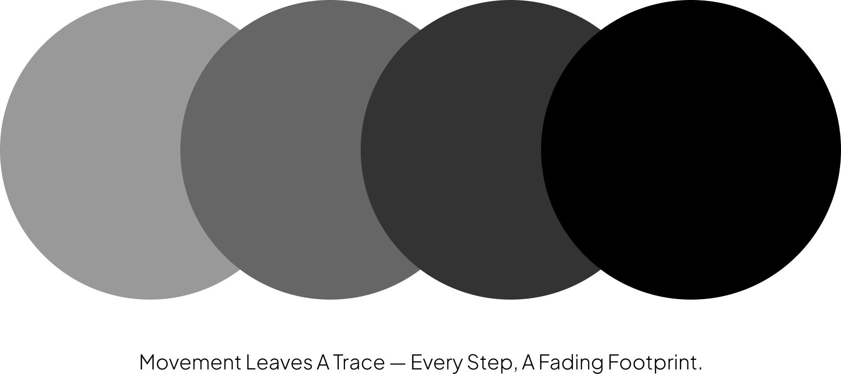
The core idea — a restaurant that moves, with no permanent home — needed to live inside the mark itself. The identity had to feel premium and considered, not casual or food-truck-coded, while still capturing a sense of constant motion.
The Concept
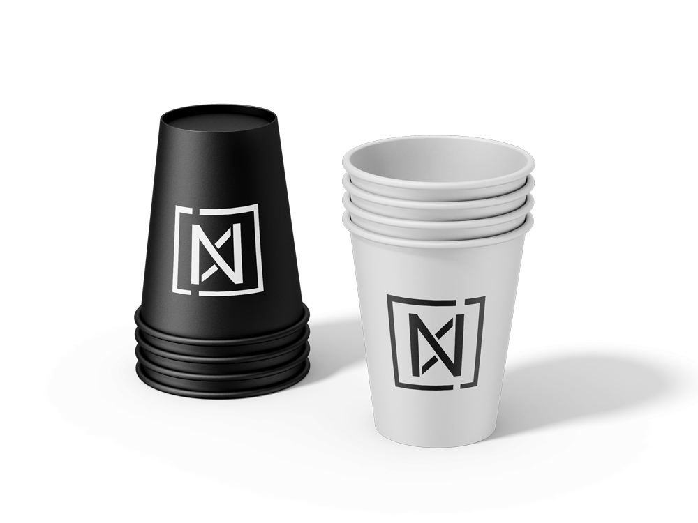
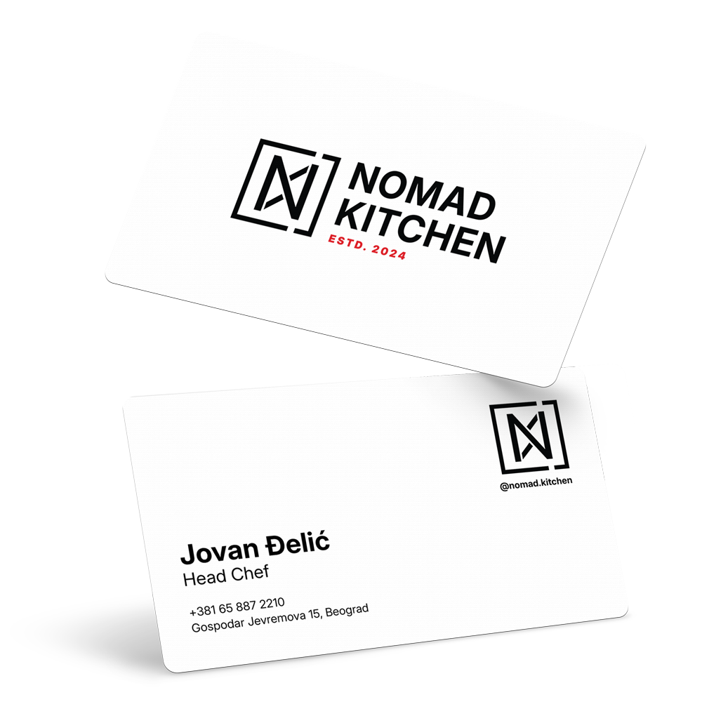
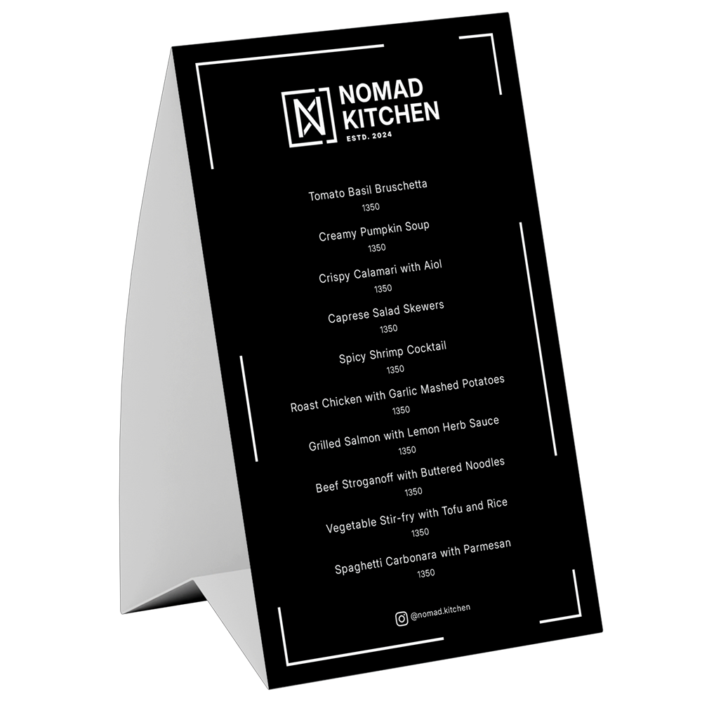
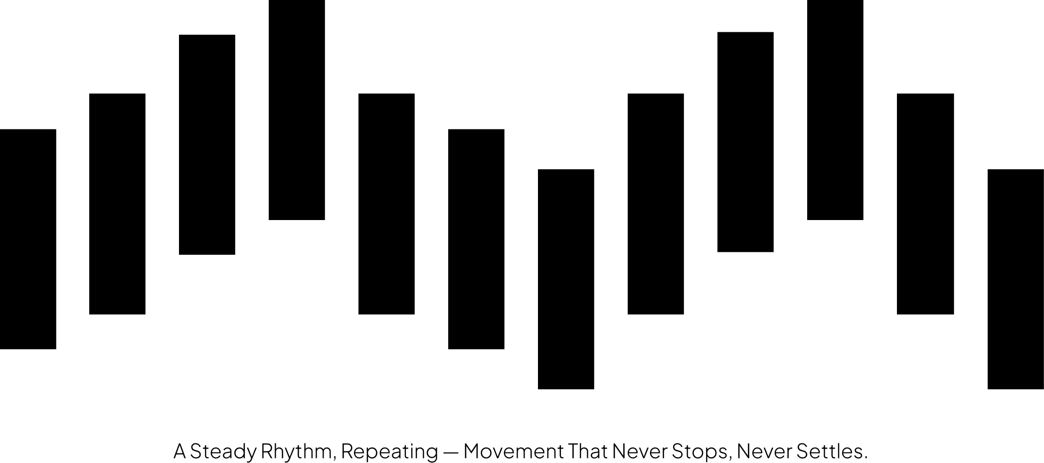
The mark is built around the letter N, shaped to suggest an infinity symbol — a nod to Nomad's continuous movement, a brand always in motion, never standing still. The N sits inside a frame with a deliberate break on the right side: a small gap that signals the brand thinks outside the box, unbound by fixed rules or a fixed location.

Brand in Action